

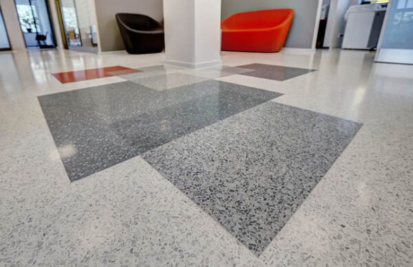
How the right blend, flake size, and finish can keep your floor looking clean, consistent, and intentional over time
Decorative flake epoxy flooring is popular because it does more than protect concrete—it changes the entire look of a space. The blend you choose affects how bright or muted the floor feels, how it reads under different lighting, and how well it masks everyday realities like dust, tire marks, pet hair, minor scuffs, and tracked-in debris.
What many people don’t realize is that flake systems don’t “age” the same way across all colors and blends. Some combinations stay visually consistent longer simply because they’re better at handling the way garages, workshops, and light-commercial spaces are actually used.
This guide breaks down how decorative flake blends work, what changes the appearance over time, and how to choose a flake style that stays looking sharp without turning into a constant cleaning project.
How decorative flake epoxy flooring gets its look in the first place
Decorative flake systems are usually built as a layered floor:
- Concrete prep to create a clean, sound surface
- A base coat (often tinted) that sets the background color
- Flake broadcast that creates the pattern and visual texture
- Scrape/vac to remove loose flake and level the surface profile
- A clear topcoat that seals everything in and controls sheen (gloss level)
The “color blend” you see is really a combination of three things working together:
- Flake colors (the mix of chips)
- Flake coverage (how dense the broadcast is)
- Base color + lighting + topcoat sheen (what ties the whole system together)
That’s why two floors using the same flake blend can still look different—because the base color and lighting can shift the final impression.
Flake size changes the floor’s “visual noise” and how it hides everyday mess
Flake comes in different sizes, and size affects the pattern more than most people expect.
Smaller flake reads smoother and more uniform
Smaller chips tend to create a tighter pattern. Visually, this can feel:
- Cleaner and more even at a glance
- Slightly less “busy” in compact garages
- Easier to pair with modern wall colors and cabinetry
It also tends to hide fine dust well because the pattern breaks up light, especially under overhead LEDs.
Larger flake reads bolder and more textured
Larger chips create bigger color variation. This can look:
- More decorative and high-contrast
- Great in larger garages or commercial areas where you want the floor to stand out
- Stronger at disguising small stains and random marks simply because the pattern is more varied
Neither is “better”—the key is matching size to the space. In smaller rooms, oversized pattern can feel visually crowded; in big spaces, small pattern can feel flat from a distance.
Blend density: why “how much flake” matters as much as the colors
When people talk about a blend, they often focus only on the colors. But density (coverage) is what controls whether the floor looks speckled or fully patterned.
Light-to-medium broadcast (more base color showing)
This look has more background and can feel more minimal. It can also:
- Make the base color a bigger part of the final look
- Create a cleaner, simpler appearance
- Show a little more of daily dust in some environments, depending on base color and traffic
Heavier broadcast (more flake dominating the appearance)
A heavier broadcast puts the blend front and center. This style tends to:
- Make the floor look more consistent overall
- Reduce how much the base color influences the finished look
- Mask day-to-day marks well because the pattern is more complex
In practical terms, dense blends usually look “busy” in a good way—they camouflage the small stuff that happens in real garages and work areas.
Choosing flake colors that age well with dust, tire marks, and normal scuffs
Garages and shops don’t stay pristine. The best-looking floors over time are usually the ones designed with normal use in mind.
Mid-tone blends are the most forgiving
Blends built around mid-grays, tans, and mixed neutrals tend to stay visually consistent because they’re closer to the color of:
- Dust and light grit
- Everyday smudges
- Minor scuffing that shows in reflected light
That doesn’t mean you can’t choose darker or lighter blends—it just means mid-tones are naturally better at “blending in” normal life.
High-contrast blends look crisp—especially when the space is clean and well-lit
High-contrast blends (strong black/white contrast, bold accent chips) can look striking. They often work best when:
- The garage has strong lighting (bright LEDs)
- Walls and storage are clean-lined and intentional
- You like a dramatic, high-definition look
Over time, these can still look excellent—just know they make the floor’s pattern more noticeable, so the space reads more “designed,” not understated.
Warm neutrals can make a garage feel less industrial
If a space is attached to the home or used as a gym, hobby room, or hangout area, warm blends (taupe, sand, soft browns with gray) can:
- Match warmer interior paint tones better
- Look inviting under mixed lighting (daylight + warm bulbs)
- Pair well with wood storage or tan/bronze fixtures
Base coat color: the hidden lever that changes the blend’s final vibe
Even with a dense broadcast, the base coat still matters—especially in edges, tight corners, and transition areas.
Here’s what base color commonly does:
- Dark base deepens the floor and can make blends feel richer and slightly darker overall
- Light base brightens the overall look and can make a garage feel more open
- Mid-tone base keeps the blend balanced and reduces extremes
A simple way to think about it: base coat is the “background paint” behind your blend. If you want a blend to read lighter or warmer, base color is one of the easiest ways to steer the result without changing the flake blend itself.
Lighting: why the same decorative flake epoxy flooring can look different at noon vs night
Lighting is one of the biggest reasons people are surprised after installation—especially in garages that use both daylight and LEDs.
Daylight shows true color but can increase contrast
Natural light often makes colors read more accurately. It can also emphasize contrast in a blend, especially near the garage door where light is strongest.
Cool LEDs can push blends toward gray/blue
Many garage LED fixtures are cool-white. That can make:
- Warm tans look more neutral
- Grays look slightly cooler
- Whites appear brighter, increasing contrast
Warm bulbs soften contrast
Warmer lighting tends to reduce harsh contrast and make blends feel softer. If the garage is used like a living space (home gym, lounge, workshop), warmer lighting can make the floor feel more cohesive with the house.
If you’re choosing a blend and you already know your lighting setup, it’s worth imagining the floor under that exact light—not just under showroom lighting.
Topcoat sheen: keeping the floor looking “clean” without making it feel too shiny
The clear coat is what you walk on, roll on, and live on. It also controls the floor’s “reflection.”
A few real-world appearance notes:
- Higher sheen reflects more light, which can make the floor look brighter and more polished
- Lower sheen reduces reflections, which can make minor surface marks less noticeable in certain lighting
Both can look great. The best choice depends on whether you prefer a more polished look or a more understated finish—especially if the garage has intense overhead lighting that creates reflections.
Blend choices that pair well with common garage and shop styles
Here are practical “match-ups” that tend to look intentional for years:
Modern garage (white walls, black cabinets, clean lines)
- Neutral gray blends with small-to-medium pattern
- Slight accent chips (subtle black/white) for definition
- Works well with bright lighting and a tidy layout
Busy family garage (kids, bikes, storage, daily movement)
- Mid-tone blends with moderate-to-dense pattern
- Mix of gray + tan + white chips to mask daily dust
- A “lived-in friendly” look that still feels clean
Workshop/DIY space (tools, projects, rolling equipment)
- Medium-to-darker blends that don’t show every smudge
- Balanced contrast so the floor doesn’t feel too dark
- Pattern that visually disguises minor scuffs between cleanings
Light commercial (small warehouse, service bay, storage areas)
- Neutral blends that look professional and consistent
- Pattern density that reduces visible tracking
- Color choices that coordinate with walls, racks, and safety markings
Final thoughts on choosing a flake blend you’ll still like later
Decorative flake epoxy flooring is a practical finish, but it’s also a design decision you’ll see every day. The blends that tend to stay looking “right” over time are the ones chosen with real conditions in mind: dust, traffic paths, lighting, and how clean the space stays week to week.
If you want the safest long-term visual bet, mid-tone blends with a balanced pattern usually keep things looking consistent. If you want a more dramatic look, higher contrast blends can look excellent too—especially when lighting and the rest of the space are planned around that sharper visual style.